How Link in Bios Prevent User Success According to Creators
Putri Karunia • 2022-08-12
We launched our waitlist for Typedream Mobile a month ago, and we have interviewed 30 users so far. We learned a lot about what’s missing from current Link in Bio solutions, what visitors are looking for, and what creators need. Let’s break it down!
During our interviews, we asked about people’s perspectives and experiences with link in bio, both as a visitor and a creator. From there, we compiled the responses into the following learnings:
Visitors' point of view
How do visitors land on your link in bio
There are several flows that a visitor went through before they land on your link in bio, and they each have a different objective.
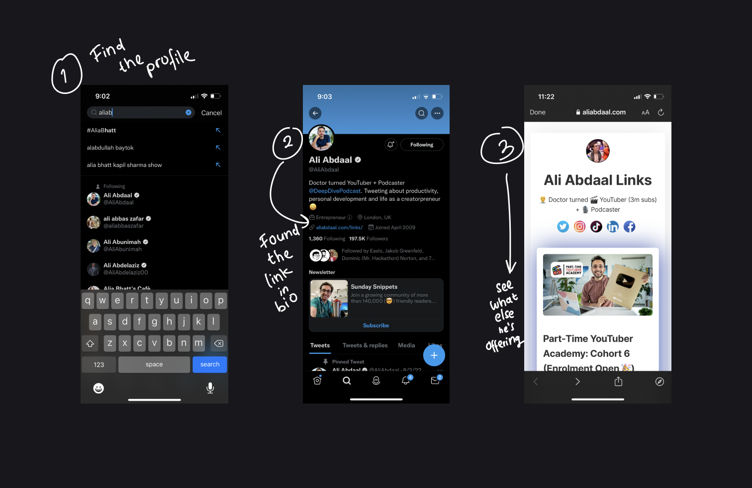
1. Discovered a post from their feed/FYP
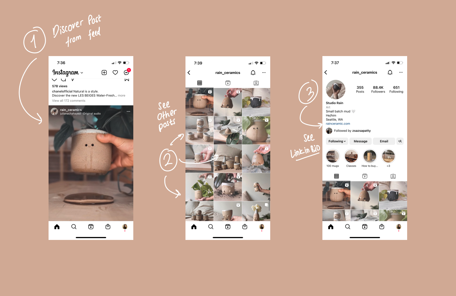
Visitors discover link in bio via post from their feed or FYP
The user was scrolling on social media, they saw your post on their feed or FYP. They’re interested, so they clicked your profile and see other posts. Since your posts seem to interest them, they want to learn more about you, they checked out your profile description and your link in bio.
→ Objective: Learn more about the person
2. You told them to check out your “link in bio”
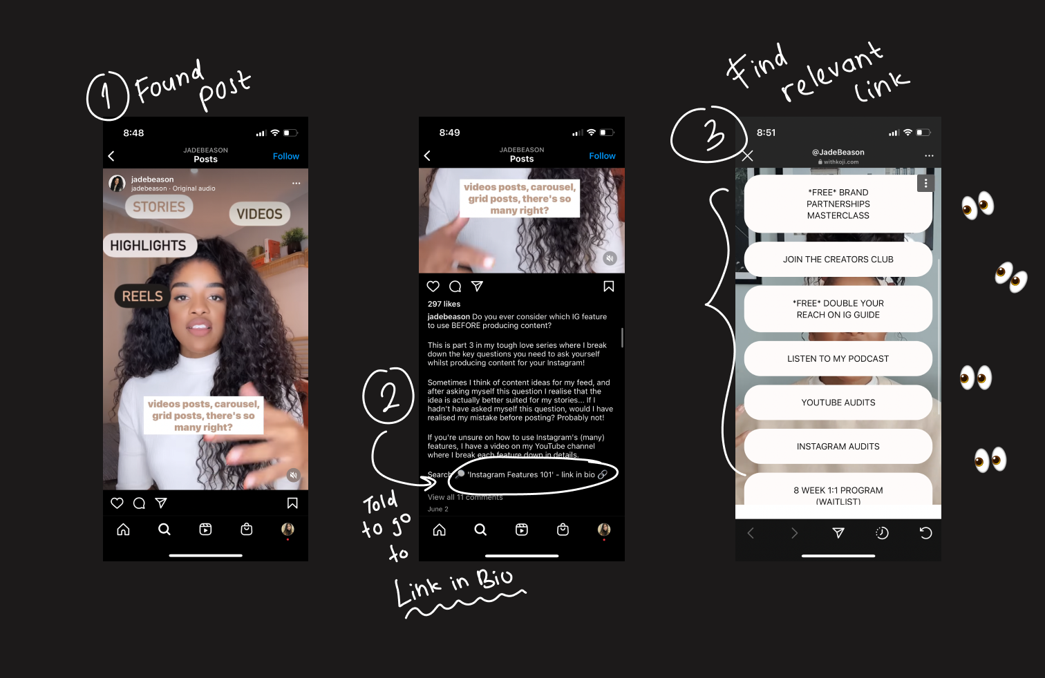
Visitors discover link in bio because their were told to go there
The visitor found either a post from you, or participated in an event where you speak, and you encouraged them to check your “link in bio” in that post or event for a specific reason. The visitor would go to your link in bio following your instructions to find that specific something that you’re marketing.
For example, you might be posting a Tiktok video about your desk setup, and you have a promo affiliate link for your audience to purchase a desk with a 10% OFF. You told them to check your link in bio for the promo link.
→ Objective: Find a promo link to buy a desk
3. They know about you, have been following you, and just want to know what else you have to offer these days
Visitors know about you and your link in bio, and was checking it out
These visitors are usually your followers or someone who knows or has heard about you and wanted to see what else you have to offer. New podcast, new blog, new song, new book? What’s up? They would search your name, click on your profile, and click your link in bio, expecting something interesting to show up on your link in bio.
→ Objective: See what else you have to offer
A lot of visitors are unable to reach their objective with the default “list of links”-styled Link in Bio
Most link in bios are lists of links and visitors can't reach their objective in finding what they need
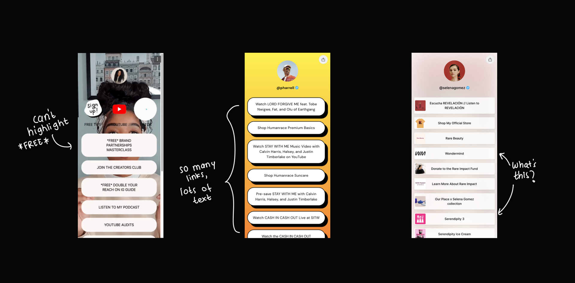
Check out this link in bio for Pharrell Williams, you’ll find 25 links that all look the same. If I wanted to find out more about his soap product line, I’d have to read each link and know exactly what I’m looking for to find it. And if wanted to learn more about him, what he’s up to, and what else does he do other than making mindblowing songs, I’ll learn that he “has a ton of things” but I don’t know what they are... I just know that he must be a super busy guy 😃
The biggest reason why visitors won’t be able to reach their objective when checking a link in bio that looks like this is that it contains zero visual cues or hierarchies that help visitors break down the information. People don’t read, they skim. So they need digestible chunks that they can digest by “seeing” without “reading” and easily focus on what they’re looking for.
Creators' point of view
As a creator, what’s the goal of having a link in bio?
After talking to a variety of people with different backgrounds and use cases, we found 4 main things that creators want from their link in bios:
- Drive visitors to see their other social media
- Lead generation: get visitors to signup to their mailing list, course, etc
- Buy their product/service/content or share affiliate links
What pain points that creators have with the current link in bio solutions in the market?
Current solutions offer essentially a uniform-looking link in bios with uniform-looking links inside.
- They can’t personalize their link in bios to their needs and brand. And honestly, most link in bios looks pretty bad
- They can’t organize the 25 things they’re offering into digestible chunks of information
- There’s no way to “explain” something. Some products require explanation, getting 1 button for each product makes it very hard to explain what that button represents.
Building the perfect fit for both visitors and creators
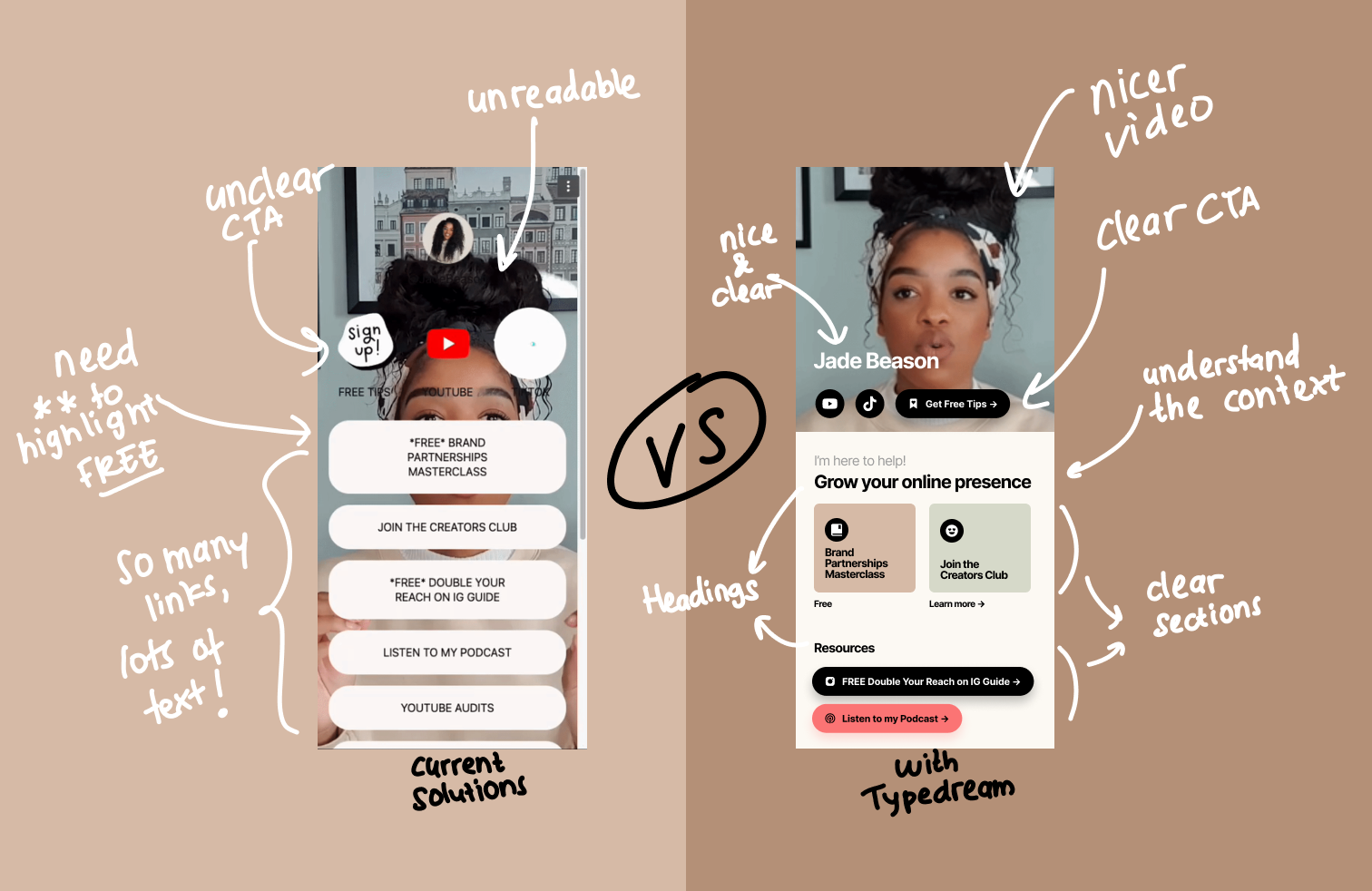
Adding clear CTA, sections, ad headings helps visitors find what they need more easily
If you read the research above carefully, you’ll see there’s some gap between what visitors are looking for and what creators want to show in their link in bio. A lot of creators focus on what they want their visitors to do, which is either follow them on other social media or buy something, both of which are attainable by the current link in bio solutions. But they forgot that their visitors aren’t going to do what they want just like that.
These visitors are mobile users, they have a VERY low attention span. They may have just watched your incredible Tiktok video about this eco-friendly facial cleanser you’re launching, but completely forgot the name. When they clicked your link in bio and see 10+ links, they’re not going to press each one. They’ll give up.
So we need to very gently move them along, make everything as easy as baby steps, until they reach the goal which is to buy that facial cleanser.
Why not use a responsive site as their mobile site?
Most desktop sites have a proper text hierarchy, images, and clear CTAs, so why not just use that? We asked this question in each interview, and here’s the answer: Their users are mobile-first, so why use a website that’s optimized for desktop but “works for mobile”? They want something that’s completely optimized for mobile but maybe works for desktop, although that’s not even required.
Our vision for Typedream Mobile
Aside from making sure that these mobile sites are easily editable from mobile phones, we want to build the perfect mobile site layout that allows visitors to reach their objectives and allow creators to reach their goals. The key is on organizing information so mobile visitors can find what they’re looking for with zero effort.
Help us shape the next generation of mobile sites
Everything we build is built on top of the feedback from people like YOU. If you’re interested in the product, or the problem, join the waitlist and help us build this perfect mobile site builder:
Thanks for reading 💕
Looking forward to building better mobile sites with you 😻. If you enjoy this post, let me know!
- Putri